Toolbars
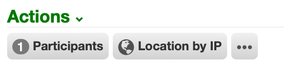
A toolbar is a collection of interactions and menus.
Top-level toolbar items are displayed as buttons. Items within a menu are displayed as links.
KATA
Toolbars are configured using a KATA dialect, which can pass custom input to the interaction using placeholders (current worker, record, etc).
interaction:
An interaction begins when it is clicked in the toolbar.
interaction/participants:
  label: Participants
  badge: {{record_participants|length|default(0)}}
  uri: cerb:automation:cerb.ticket.participants.manage
  inputs:
    ticket@key: record_id
  #hidden@bool: no
  after:
    refresh_widgets@csv: Actions

interaction/locationByIp:
  uri: cerb:automation:example.interaction.locationByIP
  label: Location by IP
  icon: globe
  after:
refresh_widgets@list: Actions| Req'd | Key | |
|---|---|---|
| x | uri: |
The URI of the interaction.worker automation to start when clicked. |
inputs: |
The optional inputs dictionary for the interaction. | |
label: |
The label to describe the interaction in buttons and menu links. This may be omitted if an icon is provided. | |
icon: |
The optional icon to display in buttons and menu links. This can be in addition to, or instead of, the label. | |
tooltip: |
If a button only has an icon and not a label, the tooltip can show a label when hovering over it. | |
keyboard: |
An alternative keyboard shortcut to start the interaction (e.g. Ctrl+Shift+K) |
|
badge: |
The optional counter to display on buttons. | |
hidden@bool: |
Conditionally determine whether to display this toolbar item or not. For instance, check worker permissions or record fields. | |
after: |
Actions to take when the interaction completes successfully. For instance, a completed interaction on a dashboard can refresh any number of widgets by name to show updated data. Options here depend on the toolbar. |
menu:
Menus may contain any combination of interactions and submenus.
menu/moreMenu:
  icon: more
  tooltip: More
  items:
    menu/tools:
      label: Tools
      items:
        interaction/debug:
          uri: cerb:automation:example.interaction.echo
          label: Debug
          icon: bug
| Req'd | Key | |
|---|---|---|
| x | label: |
The label to describe the menu in buttons and menu links. This may be omitted if an icon is provided. |
icon: |
The optional icon to display in buttons and menu links. This can be in addition to, or instead of, the label. | |
| x | items: |
A list of menu and interaction items. |
default: |
Display a "split" menu button. Clicking on the left-side immediately runs this default interaction by name. Clicking on the right-side opens a menu of alternative options. |
Records
Toolbars can be configured from Search » Toolbars.
| Toolbar | |
|---|---|
| automation.editor | Editing an automation |
| comment.editor | Editing a comment |
| draft.read | Reading a draft message |
| global.menu | Global interactions from the floating icon in the lower right |
| global.search | Searching from the top right of any page |
| mail.compose | Composing new email messages |
| mail.read | Reading email messages |
| mail.reply | Replying to email messages |
| record.card | Viewing a record card popup |
| record.profile | Viewing a record profile page |
| record.profile.image.editor | Editing a record profile image |
| records.worklist | Viewing a worklist of records |